Com Swiftgallery documentation
Installation
The component will attempt to copy some demo images to the folder images/stories/com_swiftgallery.
To Create a Gallery
Upload some images to a folder on your site, either by ftp or using the Joomla media manager.
Then create a new menu item using the Joomla menu manager. Give it type Com Swiftgallery->default layout. If you save it as it is you should see the demo gallery (assuming the images were copied on installation).
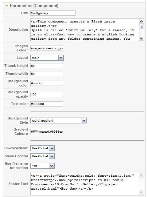
You can modify your gallery using the component parameters for the menu item. These are shown in the illustration below.

Parameters
Title
This is the gallery title (obviously!). It will appear at the top of your gallery.
Description
This is the text that will appear at the top of the gallery. Allowable html tags are: p, pre, h heading tags, span, div, and a.
Images Folder
The path (relative to your site root) of the images folder (no trailing /).
Layout
Choose the layout. The choices are main (horizontal), or vertical. We plan to add more in the future.
Thumb Height and Thumb Width
The dimensions of the thumbnails in pixels.
Background Colour and Text Colour
The background colour and the text colour are fully customizable. The values must be expressed as html-style 6-digit hex values (eg #ffffff). The background colour chosen here applies if the background style is set to 'solid', otherwise the values specified using the 'gradient colours' parameter will be used to draw the background.
Background Opacity
This can vary between 0 (completely transparent) and 100 (completely opaque)
Background Style
The choices include 'solid', and 10 different gradient patterns.
Gradient Colours
You can specify the colours used for a gradient background as a comma-separated list of 6-digit hex values (eg #ffffff,#999999,#cccccc)
Downloadable
Choose whether the viewer will be able to download images by right-clicking. Default is 'no'.
Show Caption
Choose whether or not to display a caption. Default is 'yes'
Use File Name for Caption
Choose the source of the caption. If the default 'no' is chosen, the component will try to read a caption from the Exif metadata for the image.
If 'yes' is selected, the component will extract the caption from the file name. The characters '-', and '_' will be converted to spaces, while the .jpg extension will be removed. So the file 'A-vase-of-flowers.jpg' becomes 'A vase of flowers'.
Using the Content Plugin
This plug-in requires the Swiftgallery component to be installed as well.
To embed the gallery, use the following format:
with the parameters specified as a list separated by semi-colons (;).
or just
All the parameters are optional, if none are specified the default values (those shown above) will be used.
The options available for transitionType are:-
- none
- ffade
- fade
- photo
- rotate
- squeeze
- zoom
- random
The options available for bgstyle are:-
- solid
- linear_gradient
- radial_gradient
- repeated_gradient
- repeated_horizontal_gradient
- repeated_diagonal_gradient
- radial_bars_gradient
- radial_complex_gradient
- radial_complex_gradient_2
- radial_complex_gradient_3
- radial_complex_gradient_4


